
With the Wigle WiFi app running on an Android phone, a hacker can discover and map any nearby network, including those created by printers and other insecure devices. The default tools to analyze the resulting data can fall short of what a hacker needs, but by importing wardriving data into Jupyter Notebook, we can map all Wi-Fi devices we encounter and slice through the data with ease.
Thanks to low-cost Android smartphones equipped with GPS and Wi-Fi sensors, wardriving has gotten easier than ever. With a $60 Android smartphone and Wigle WiFi, it's possible to map the time and location that you encountered any Wi-Fi or Bluetooth device, with cellular data towers thrown in for good measure.
The data produced by wardriving can be extremely valuable. Still, the tools to analyze that data automatically can also come with the problem of exposing the networks you collected by publishing them to a public database like Wigle.net.
In [ ]: import pandas as pd
        import folium   # (https://pypi.python.org/pypi/folium)
        df = pd.read_csv('/Users/skickar/Downloads/WigleWifi_20190723192904.csv', delimiter = ',', encoding='latin-1', header=1)

        mymap = folium.Map( location=[ df.CurrentLatitude.mean(), df.CurrentLongitude.mean() ], zoom_start=12)
        #folium.PolyLine(df[['Latitude','Longitude']].values, color="red", weight=2.5, opacity=1).add_to(mymap)
        for coord in df[['CurrentLatitude','CurrentLongitude', 'SSID', 'Type', 'MAC']].values:
            if (coord[3] == 'WIFI'):
                folium.CircleMarker(location=[coord[0],coord[1]], radius=1,color='red', popup=["SSID:", coord[2], "BSSID:", coord[4]]).add_to(mymap)
        #mymap   # shows map inline in Jupyter but takes up full width
        mymap.save('testone.html')  # saves to html file for display below
What Data Comes from Wardriving?
When you think about the data you can get from wardriving, a couple of useful examples pop out. For one, it's easy to find devices like printers, security cameras, or IoT devices that create their own Wi-Fi hotspots. Another piece of data captured while wardriving is the type of security a device is using, making it easy to drive through a city and plot the exact location of every unencrypted or critically vulnerable network.
Another benefit of analyzing wardriving data is the ability to determine what types of devices are in a given area. Each manufacturer has a unique MAC address prefix that is captured during wardriving, allowing a hacker to identify the manufacturer of any broadcasting Wi-Fi device. For a hacker, the ability to get a picture of the Wi-Fi, Bluetooth, and cellular signals just by getting an Android smartphone near the target is a huge advantage.
Slicing Through the Data with Jupyter & Pandas
Wardriving gives us a lot of useful data, but like analyzing any big data set, the patterns can be hidden underneath lots of irrelevant data. Sorting through it all can be a pain, but fortunately, Wigle.net and the Wigle WiFi app make it possible to do some analysis of the data without any work at all. If, however, you do not want to upload your wardriving capture to a public database like Wigle.net, you can have access to many of the same tools to explore and plot data through Jupyter Notebook.
Jupyter Notebook is a Python-based tool for analyzing large data sets, and it allows us to take in data from wardriving to map and interpret however we like. Today, we'll be reading in a CSV file from Wigle WiFi and plotting information about the networks we've observed on a map. The danger of doing so ourselves is that we can run into errors when our source of data has missing or unexpected values, making cleaning our data an essential part of working with it on our own.
To clean a dataset for analysis, we'll need to write some code to hunt down troublesome values like "null" results where no entry was saved, as these will cause any attempt to map the dataset to fail. We'll also write code to filter listings by the type of signal, so we can focus on Wi-Fi networks and ignore Bluetooth and cellular readings. Finally, we'll also learn to filter out unexpected characters, like errant "?" characters in GPS coordinates, which cause mapping results to fail.
What You'll Need
Jupyter Notebook is free and requires only Python to install, which can be done quickly through Python's package manager, Pip. Aside from that, you'll need Wigle WiFi running on an Android phone.
Step 1: Download the Data from Wigle
To capture your own wardriving data, you can run the Wigle WiFi app on any Android smartphone. From there, you can either upload your data to Wigle.net or export the CSV file from your smartphone directly.
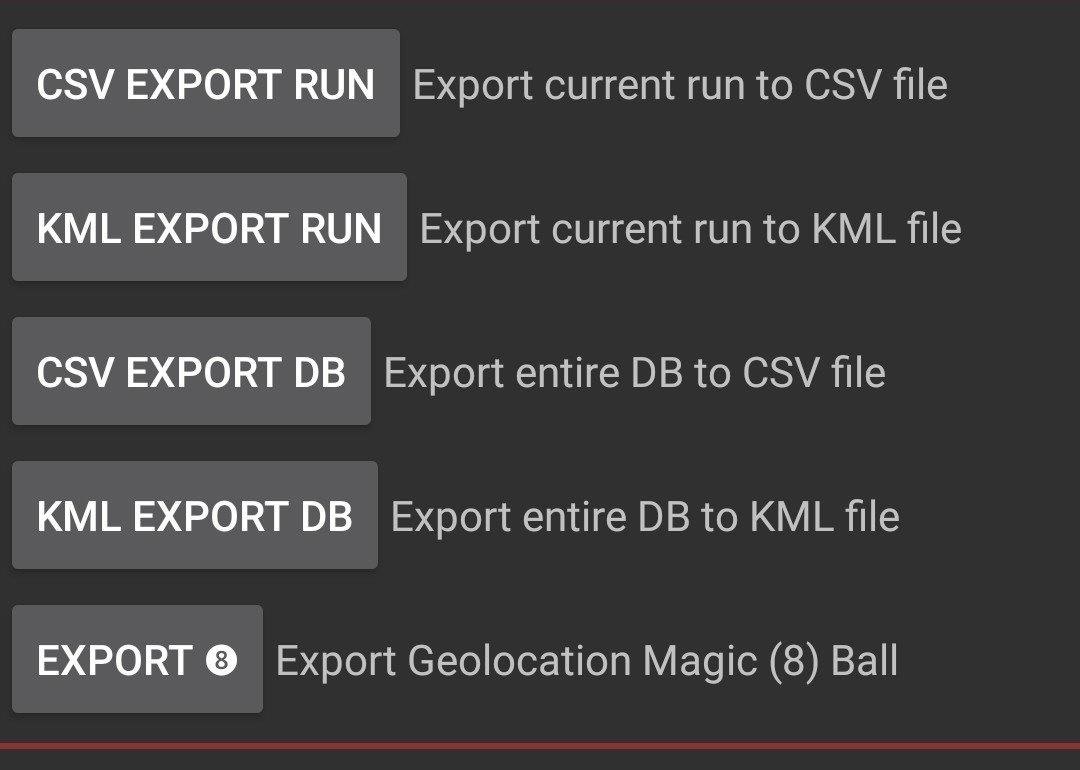
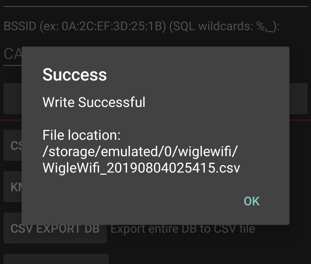
In the Wigle WiFi app, you should see the option to export your data as a CSV file in the "Database" section. Once you do so, you can send the file to yourself via email, Dropbox, or any other method you like.
If you've exported the data directly from Wigle WiFi, you can proceed to Step 2 below. I advise that you go the exporting-from-Wigle-Wifi-directly route, due to some differences in the way that data is rendered.
Otherwise, go to Wigle.net and log in with your username and password. If you don't have one, sign up for one, and then link your Wigle WiFi app to your Wigle.net account. When you upload your data, it should all be saved under the same Wigle.net account so you can retrieve it later.
If your data was stored as a KML file, you could convert it online using a KML to CSV conversion website, but you may have to work with the resulting data differently due to the way the conversion outputs the data. Because of that, it's recommended to use a CSV file exported directly from the Wigle WiFi app.
Step 2: Download Jupyter Notebook
Once we've downloaded the CSV data, we'll need Jupyter Notebook to start digging through it. Doing so is easy from any system with Python installed. You can simply install it via the Pip package manager with the following commands.
~$ python3 -m pip install --upgrade pip

Requirement already up-to-date: pip in /usr/lib/python3/dist-packages (20.0.2)

~$ python3 -m pip install jupyter

Requirements already satisfied
If you're using Python 2 instead, you can run the following commands, although Python3 is recommended.
~$ python -m pip install --upgrade pip
~$ python -m pip install jupyter
Once Jupyter is installed, we can launch it by running the following command in a terminal window.
~$ jupyter notebook

[I 01:09:37.432 NotebookApp] JupyterLab extension loaded from /Library/Frameworks/Python.framework/Versions/3.6/lib/python3.6/site-packages/jupyterlab
[I 01:09:37.432 NotebookApp] JupyterLab application directory is /Library/Frameworks/Python.framework/Versions/3.6/share/jupyter/lab
[I 01:09:37.436 NotebookApp] Serving notebooks from local directory: /Users/skickar
[I 01:09:37.436 NotebookApp] The Jupyter Notebook is running at:
[I 01:09:37.436 NotebookApp] http://localhost:8888/?token=270764925ebaf4b0cefee2d0d4e742387c460ae76ff52277
[I 01:09:37.436 NotebookApp] Use Control-C to stop this server and shut down all kernels (twice to skip confirmation).
[C 01:09:37.444 NotebookApp]

    To access the notebook, open this file in a browser:
        file:///Users/skickar/Library/Jupyter/runtime/nbserver-58428-open.html
    Or copy and paste one of these URLs:
        http://localhost:8888/?token=270764925ebaf4b0cefee2d0d4e742387c460ae76ff52277
A browser window should open, showing you the menu page for Jupyter Notebook. From here, you can select a new Python 3 notebook to get started.
Step 3: Import the CSV Data
In our blank notebook, our first task will be to import the CSV data into a dataframe. A dataframe is how the Python Pandas library handles data, and it's a versatile format for analyzing information.
First, to use Pandas, we'll need to import it. If you don't already have it, you can install it by typing in python3 -m pip install pandas a terminal window.
To work with Pandas more easily in Python, we'll import Pandas as "pd" in Jupyter and address it that way in the rest of our code. Importing Pandas and naming it "pd" looks like this:
In [ ]: import pandas as pdNext, we'll need to add our mapping library, folium. If you don't have it, you can install it with python3 -m pip install folium in a terminal window. In our Jupyter notebook, add the next line to import Folium.
In [ ]: import foliumAfter folium has been imported, we'll take our CSV file and turn it into a dataframe called "df" using the built-in pd.read_CSV function. Inside this function, we'll also specify the delimiter (how we separate the data) and the encoding type.
Finally, we'll set the "header" to row 1 rather than the default row 0, as Wigle WiFi records information about the device the information was captured on in row 0.
Put all together, our code to import the .CSV file looks like this:
In [ ]: df = pd.read_csv('/YOUR_FILE.csv', delimiter = ',', encoding='latin-1', header=1)In [ ]: import pandas as pd
import folium
df = pd.read_csv('/Users/skickar/Downloads/WigleWifi_20190723192904.csv', delimiter = ',', encoding='latin-1', header=1)To confirm that you've read in the data properly, you can sample 10 rows from the dataframe with the "df.sample(10)" command.
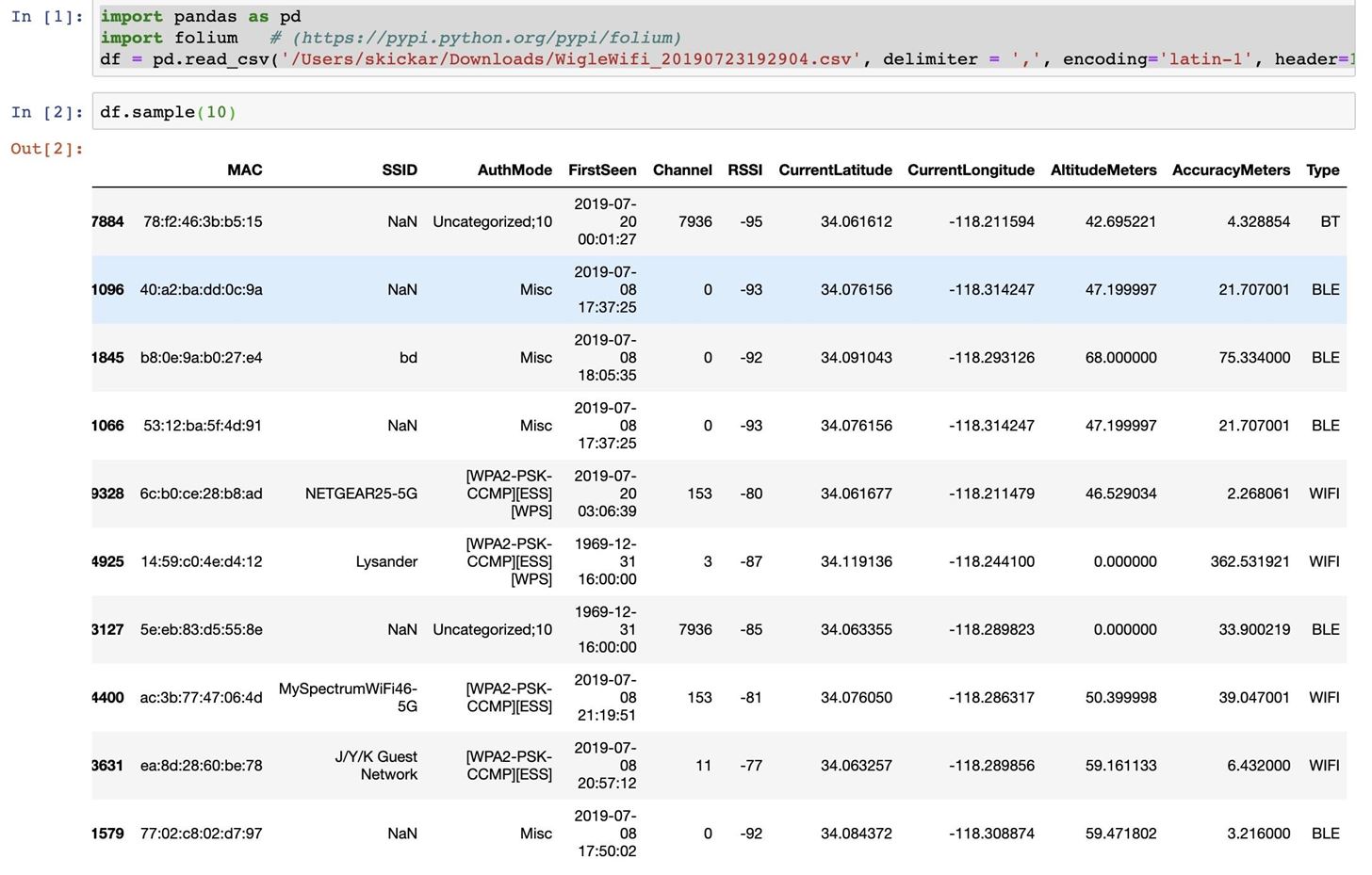
As we can see, our Wigle WiFi data has been imported, but includes Wi-Fi, Bluetooth, and cellular data devices. We'll need to clean unrelated signal types from our data before we continue.
Step 4: Clean for Signal Type
As we can see from our sample data, we still have rows that represent cellular data towers and Bluetooth devices. To remove these, we'll need to search through our dataframe and remove anything that we don't want to include.
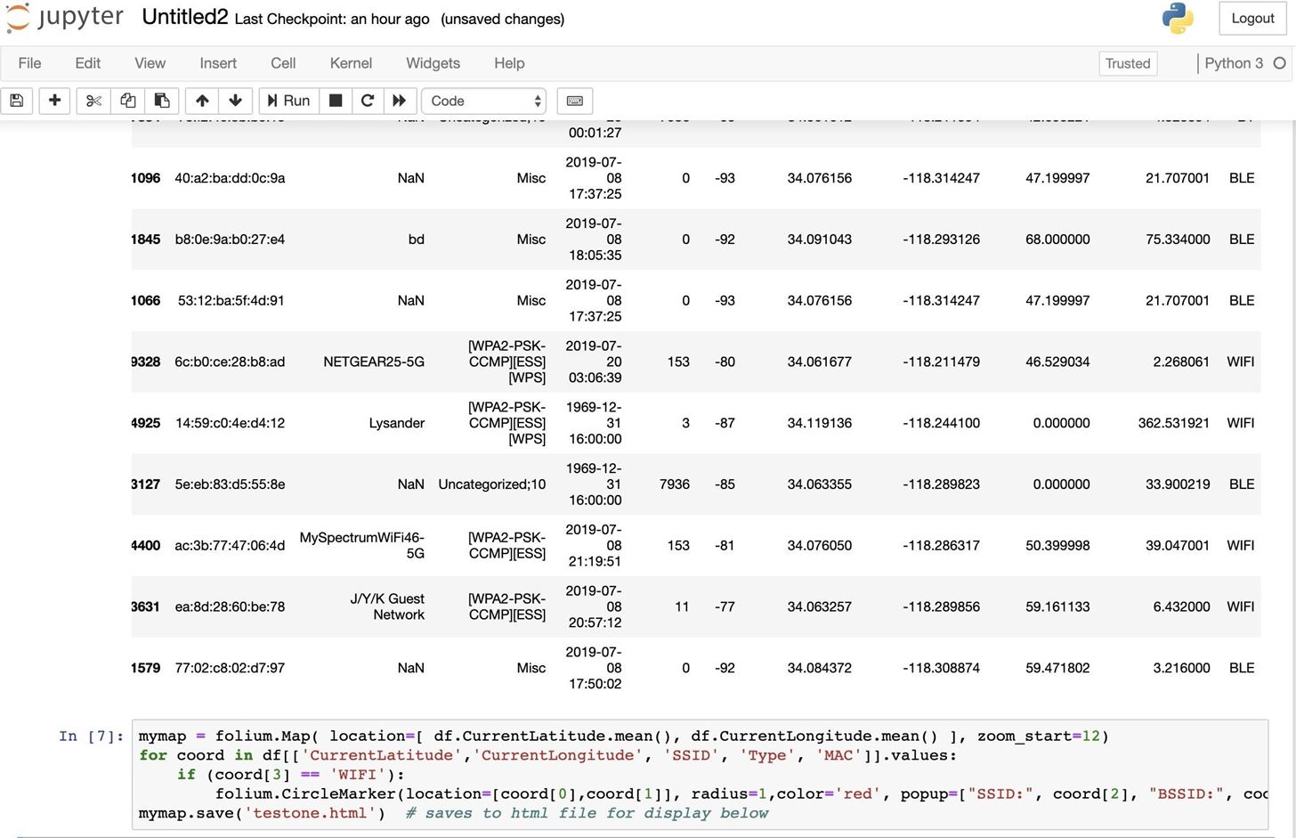
To start our map, we'll need to set the middle of the map and the zoom level. We'll do so by taking the average of all the latitudes and longitudes in our dataset. For a relatively small dataset, it should work fine, but if our data contains any null or unexpected values, it won't plot correctly and we may need to hard-code in the center of the map with coordinates.
First, we create a map called "mymap" and then set the center of the map and zoom level, which we'll set to 12.
In [ ]: mymap = folium.Map( location=[ df.CurrentLatitude.mean(), df.CurrentLongitude.mean() ], zoom_start=12)After setting the location, we can decide which values we're interested in. First, we'll read in our values, which are CurrentLatitude, CurrentLongitude, SSID, Type, and MAC. We'll be using the current latitude and current longitude to drop a marker on the map we generate, the SSID and MAC address of the network to create a pop-up when we click on the marker, and the Type to check that the information belongs to a Wi-Fi network and not a Bluetooth device.
We'll start our loop to clean our data with a "for" statement. Because we're mapping coordinates, I'm using the variable "coord" for each row, but you can use whatever variable makes sense.
In [ ]: mymap = folium.Map( location=[ df.CurrentLatitude.mean(), df.CurrentLongitude.mean() ], zoom_start=12)
        for coord in df[['CurrentLatitude','CurrentLongitude', 'SSID', 'Type', 'MAC']].values:
Now, we write the part of our loop that filters our data. We've indexed five pieces of data: the latitude, longitude, SSID, type, and MAC address. These are indexed as coord[0] through coord[4], because the index starts at 0. To check if a row is a Wi-Fi device or something we don't want to map, we can look in the coord[3], or "Type" variable, to check if it's equal to WIFI.
In [ ]: if (coord[3] == 'WIFI'):Anything that meets this condition can then be mapped, as our filter should eliminate any results that don't come from Wi-Fi devices. We'll use the folium.CircleMaker function to load the longitude and latitude of the marker to plot, which should be coord[0] and coord[1], and then we'll set the radius and color of the marker.
The last part of the marker to set is the "popup" field, which will determine what information will pop up when we click on the marker. In the popup field, we'll label the data and then pass in the coord[2] and coord[4] values, which should be the SSID and BSSID.
In [ ]: folium.CircleMarker(location=[coord[0],coord[1]], radius=1,color='red', popup=["SSID:", coord[2], "BSSID:", coord[4]]).add_to(mymap)All together, our code should look like this.
In [ ]: mymap = folium.Map( location=[ df.CurrentLatitude.mean(), df.CurrentLongitude.mean() ], zoom_start=12)
        for coord in df[['CurrentLatitude','CurrentLongitude', 'SSID', 'Type', 'MAC']].values:
            if (coord[3] == 'WIFI'):
                folium.CircleMarker(location=[coord[0],coord[1]], radius=1,color='red', popup=["SSID:", coord[2], "BSSID:", coord[4]]).add_to(mymap)
Step 5: Save Map to HTML File
Now that we've plotted our data, we can create an HTML file with it. To do so, we'll add this code.
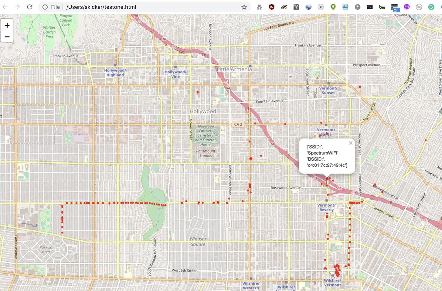
In [ ]: mymap.save('testone.html')Press the "Run" button to generate an HTML file containing the map.
You can open the resulting HTML file in any browser to see the result.
Step 6: Display Map in Iframe
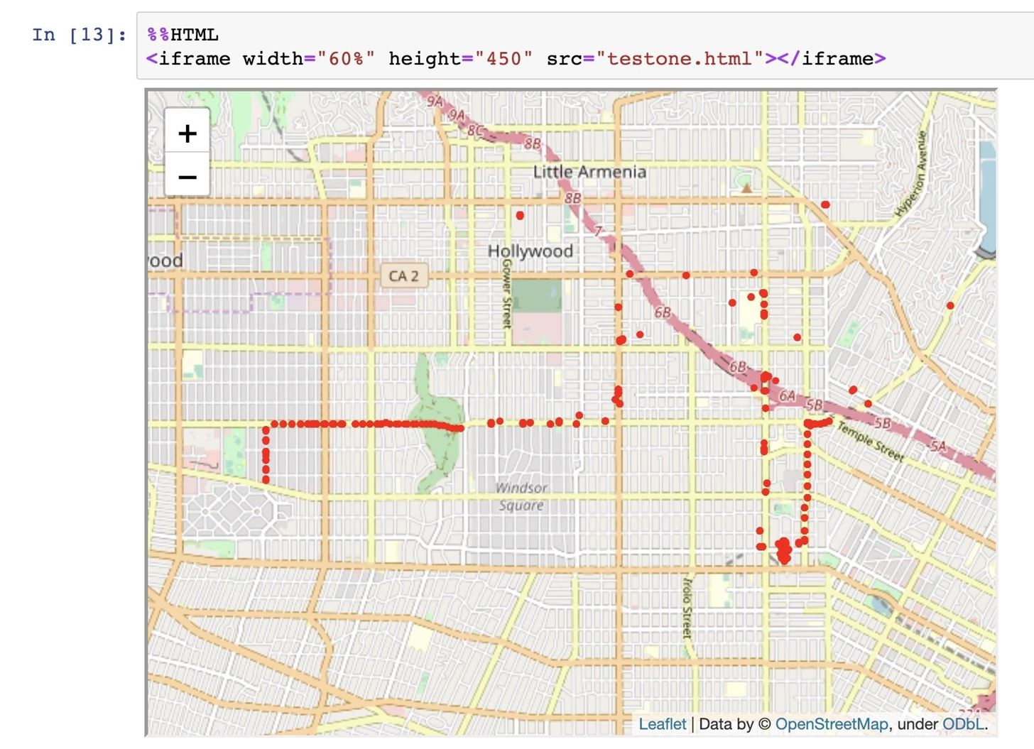
To show the map in our Jupyter notebook, we can open it in an iframe. You can apparently also just type the name of your map, but I ran into problems with this rendering correctly, while iframes always work.
To open an iframe, we can use the following code.
In [ ]: %%HTML
        <iframe width="60%" height="450" src="testone.html"></iframe>
Press run to display the iframe of our plotted map within Jupyter Notebook.
Step 7: Clean Null Values & '?' Characters
A common issue we can encounter is empty data fields, which can make large datasets impossible to plot. This will become a much bigger problem when we work with extremely large data sets.
To open and clean a very large dataset from Wigle WiFi, we first open the CSV file as normal.
In [ ]: df = pd.read_csv('/Users/skickar/Downloads/biglots.csv', delimiter = ',', encoding='latin-1', header=1)Then, we create an empty list called "valid" to hold all of the results that pass our filter and use the same filter we did before to clean any results that are not Wi-Fi networks. Anything that passes the filter, we'll append to our "valid" list with the valid.append(rows) code, which appends the contents of the valid row to the "valid" list.
In [ ]: valid = []
        for rows in df[['MAC', 'SSID', 'AuthMode', 'FirstSeen', 'Channel', 'RSSI', 'CurrentLatitude', 'CurrentLongitude', 'AltitudeMeters', 'AccuracyMeters', 'Type']].values:
            if (rows[10] == 'WIFI'):
                valid.append(rows)
Now, we can use a built-in function called .dropna() to drop any row that contains an empty value. This will eliminate a lot of rows, but will also ensure the resulting ones are clean. We'll use the .dropna() while creating a new Pandas dataframe called "validframes" from our "valid" list.
In [ ]: validframes = pd.DataFrame(valid).dropna()Now, we'll add column names to our "validframes" dataframe to make sure they're all properly labeled.
In [ ]: validframes.columns = ['MAC', 'SSID', 'AuthMode', 'FirstSeen', 'Channel', 'RSSI', 'CurrentLatitude', 'CurrentLongitude', 'AltitudeMeters', 'AccuracyMeters', 'Type']The data in "validframes" should now be clean! We can plot it the way we did with the earlier sample, although it will probably take a lot longer. Altogether, our code to open and clean a large CSV data set looks like this. We can add a validframes.head() to the end to check if our resulting data is formatted correctly.
In [ ]: #Get rid of NAN values and get rid of non Wi-Fi networks
        df = pd.read_csv('/Users/skickar/Downloads/biglots.csv', delimiter = ',', encoding='latin-1', header=1)
        valid = []
        ## Grab all Wi-Fi nets in a list called Valid
        for rows in df[['MAC', 'SSID', 'AuthMode', 'FirstSeen', 'Channel', 'RSSI', 'CurrentLatitude', 'CurrentLongitude', 'AltitudeMeters', 'AccuracyMeters', 'Type']].values:
            if (rows[10] == 'WIFI'):
                valid.append(rows)
        ## Create dataframe after dropping NAN's
        validframes = pd.DataFrame(valid).dropna()
        validframes.columns = ['MAC', 'SSID', 'AuthMode', 'FirstSeen', 'Channel', 'RSSI', 'CurrentLatitude', 'CurrentLongitude', 'AltitudeMeters', 'AccuracyMeters', 'Type']
        validframes.head()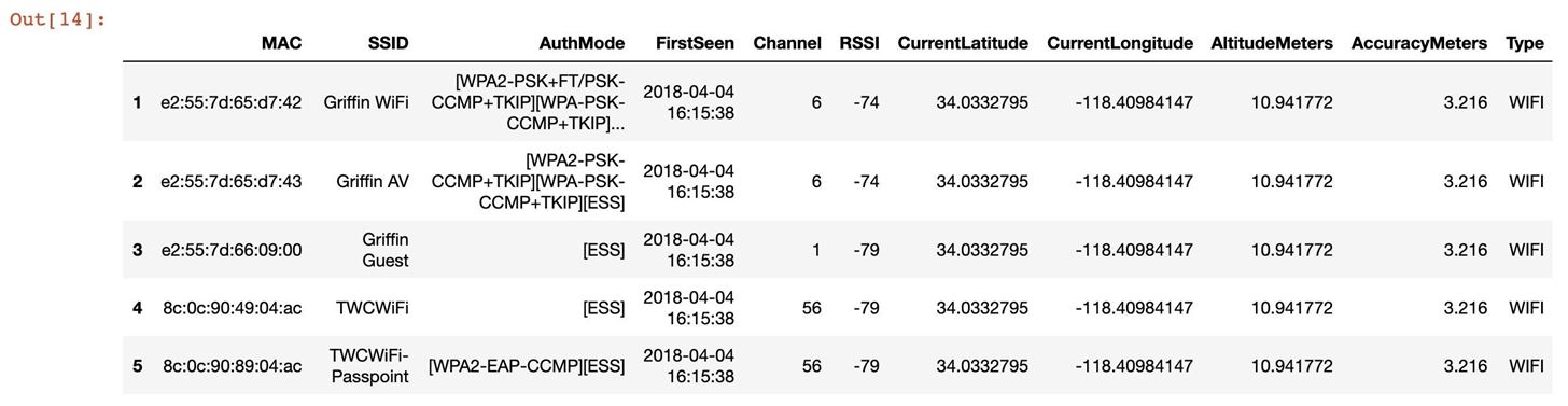
The data looks good! Now, we can map the data the way we did before, but we'll set a hard-coded location for the center of the map to avoid needing to calculate the median of a huge dataset.
In [ ]: mymap = folium.Map( location=[34.0522, -118.243683], zoom_start=12)
        for coord in validframes[['CurrentLatitude','CurrentLongitude', 'SSID', 'Type']].values:
Now, we'll set our filter to remove any longitude or latitude data that contains an "?" character, which will cause GPS locations to fail when trying to plot them. This was an issue in larger Wigle WiFi datasets. Anything that passes our filter, we can add to the map the same way we did before, and save it as an HTML file.
In [ ]: if ("?" not in str(coord[0])) and ("?" not in str(coord[1])):
                folium.CircleMarker(location=[coord[0],coord[1]], radius=1,color='red', popup=["SSID:", coord[2]]).add_to(mymap)
Finally, we'll save the plotted map to an HTML file. The finished code should look like this:
In [ ]: mymap = folium.Map( location=[34.0522, -118.243683], zoom_start=12)
for coord in validframes[['CurrentLatitude','CurrentLongitude', 'SSID', 'Type']].values:
if ("?" not in str(coord[0])) and ("?" not in str(coord[1])):
folium.CircleMarker(location=[coord[0],coord[1]], radius=1,color='red', popup=["SSID:", coord[2]]).add_to(mymap)
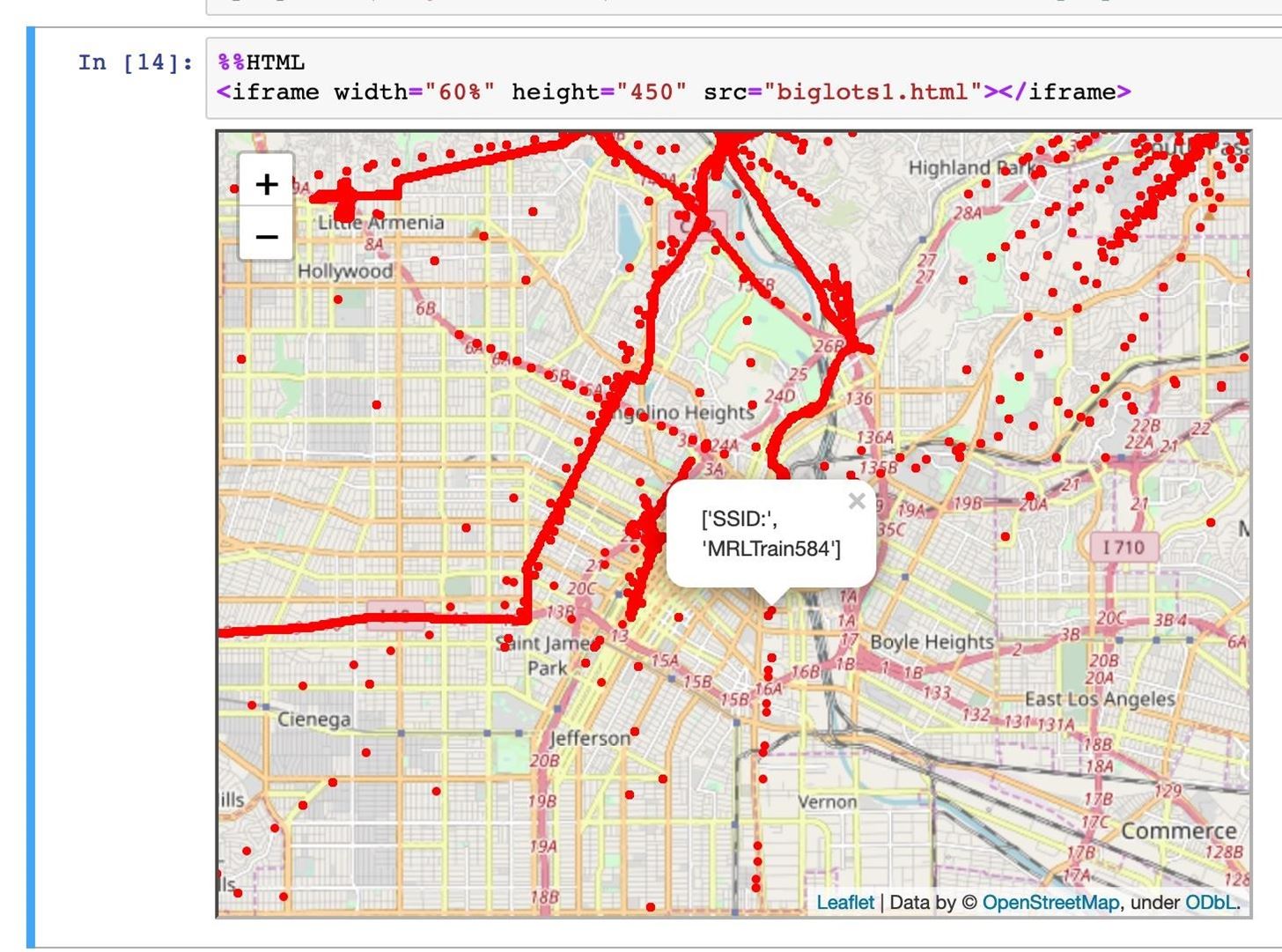
mymap.save('biglots.html') # saves to html file for display belowAfter the map finishes saving, we can display it in an iframe with the code below.
In [ ]: %%HTML
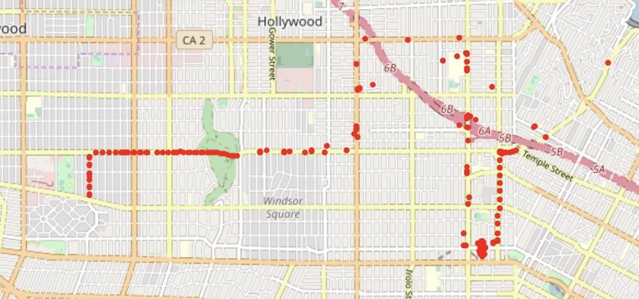
<iframe width="60%" height="450" src="biglots1.html"></iframe>If the dataset was clean and plotted correctly, you should see the result as something like below.
With Jupyter Notebook, You Can Plot Your Own Data
Jupyter gives you complete control over how you analyze Wi-Fi data you collect with the Wigle WiFi app. With these free tools, anyone can perform signals intelligence to map weak or open Wi-Fi networks and discover any Wi-Fi network containing a known string or by a particular manufacturer. Wigle.net provides a lot of useful ways of slicing through the information you collect, but nothing beats total freedom to filter, plot, and map Wi-Fi devices in Jupyter Notebook.
I hope you enjoyed this guide to plotting wardriving Wi-Fi data with Jupyter Notebook! If you have any questions about this tutorial on analyzing Wi-Fi signals or you have a comment, ask below or feel free to reach me on Twitter @KodyKinzie.
Just updated your iPhone? You'll find new emoji, enhanced security, podcast transcripts, Apple Cash virtual numbers, and other useful features. There are even new additions hidden within Safari. Find out what's new and changed on your iPhone with the iOS 17.4 update.


1 Comment
Can you make a raw file with the source code? I get lost with the indents like this. Thank you
Share Your Thoughts